Build a Wardrobe Color Palette Without Making It Flat
Use color relationships, texture, and value contrast so repeatable outfits still look distinct.

A practical palette does not require every piece to match every other piece. It needs enough shared relationships that getting dressed is easy, plus enough contrast that the wardrobe does not collapse into one repeated look.
Start with the colors already doing the work
Photograph the shoes, coats, trousers, and bags you wear most. Identify the two or three colors already connecting those pieces before inventing a new palette around an aspirational purchase.
Separate hue from value
Two garments can share a color family and still create contrast through lightness and darkness. A pale blue shirt, ink trouser, and mid-tone jacket may coordinate while preserving a clear visual structure.
Let texture carry quiet outfits
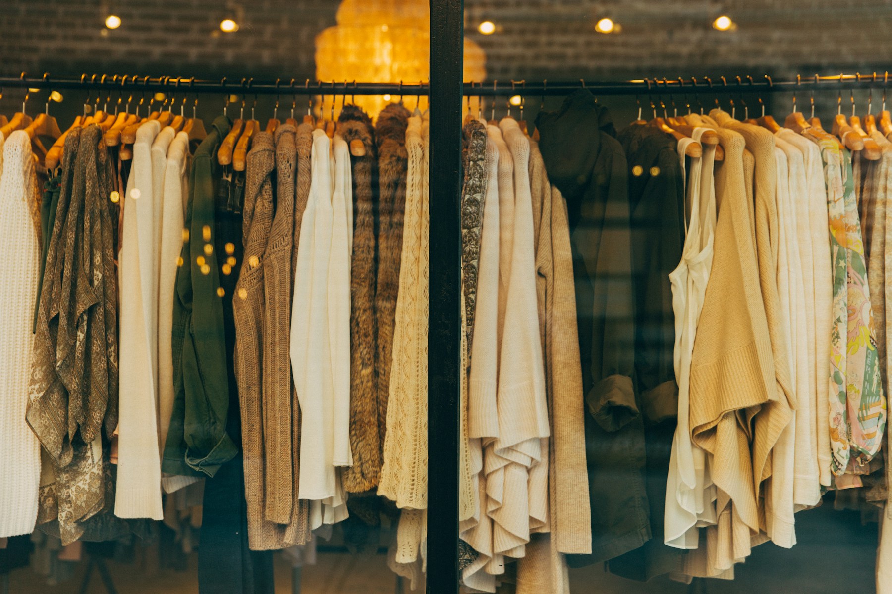
When colors are close, combine surfaces such as crisp cotton, brushed wool, smooth leather, and ribbed knit. Texture makes a limited palette feel intentional instead of unfinished.
Before you choose
- Most-worn items photographed
- Two anchor colors identified
- Light and dark values included
- Textures vary
- Accent color repeats at least twice
Send the page title and source to our editorial contact. Material corrections are dated in the article.
Contact editorial